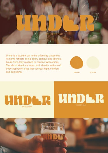


As part of a course competition, my concept UNDER was selected as the winning name and logo for our university’s student bar.
The idea celebrates friendship, shared moments, and a sense of belonging.
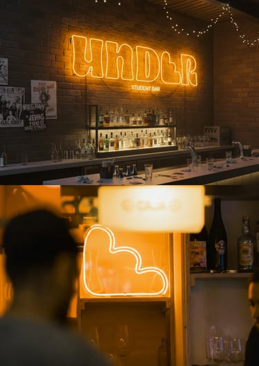
The visual direction is warm, youthful, and easy to understand, featuring a soft orange inspired by beer, simple shapes, and approachable typography. The logo is clean, adaptable, and designed to work across signage, menus, and social media. UNDER represents what the bar stands for: a place to meet, have fun, and feel at home, located in the university’s basement.
Under | Logo design